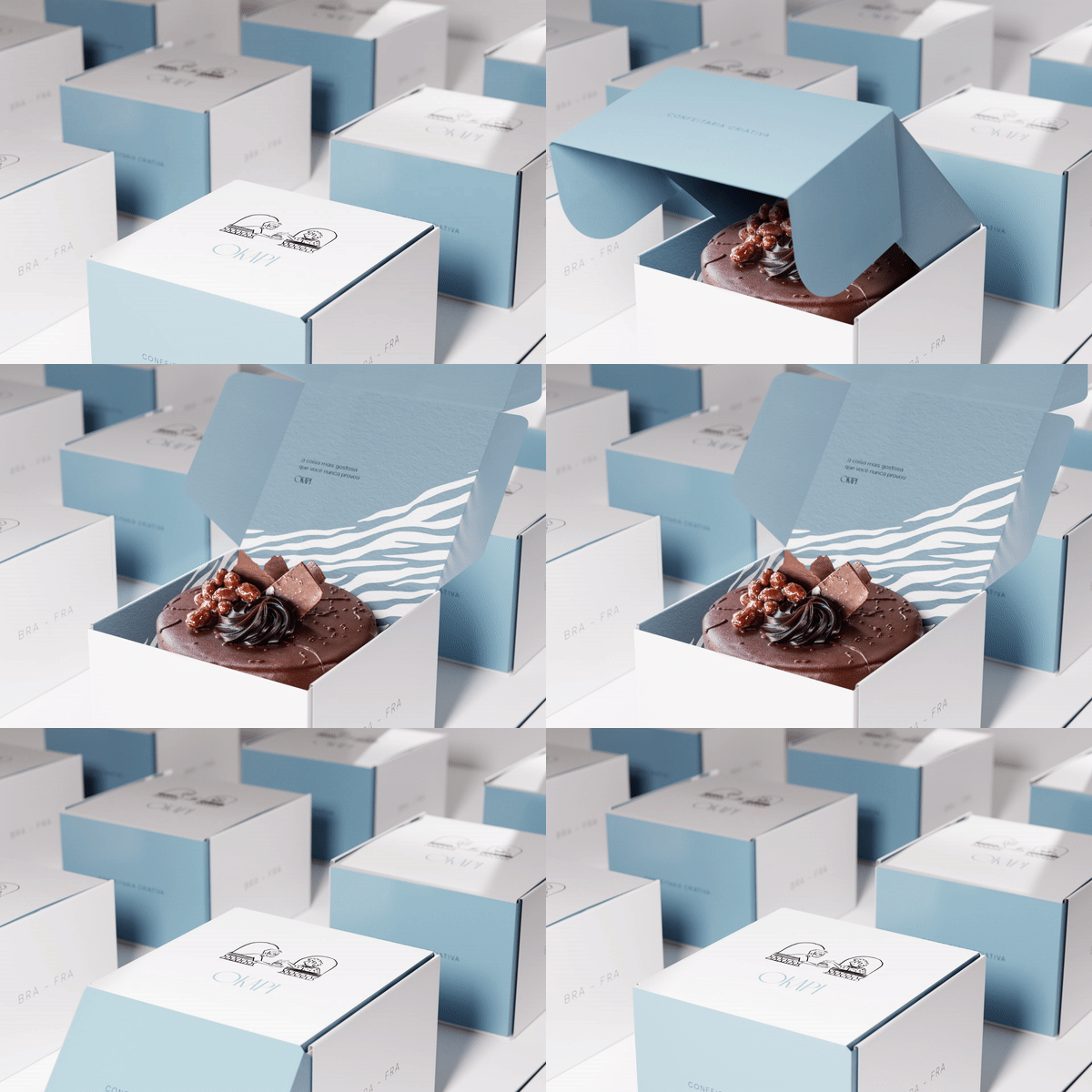
With the name inspired by the African animal with parts of a zebra and parts of a giraffe, Okapi was born from the wish of a chef that wanted to unite the best of French patisserie with the affection of Brazilian cuisine. An unusual mix, which result in deliciously surprising recipes.
The brand's positioning was materialized in a minimalist aesthetic, which refers to more traditional confectionery, together with a sense of humor expressed through illustrations and verbal identity that give lightness and brand freshness.
Whether in the design of the logo, inspired by Art Deco, or in the lightness to illustrate moments of sharing, inspiration and kindness, or even through the Okapi icon, the visual identity of the brand translates into balance. Between invention and tradition, between the sophisticated and the light, between humor and sobriety.


